본문 바로가기

Information

[수업 여덟번째 시간] 웹린이의 여덟번째 html 수업 시간

반응형


CSS box-sizing 속성

box-sizing 속성은 CSS의 테두리 영역의 크기를 결정함

box-sizing 속성값에는 content-box와 border-box가 있음


  • content-box : 지정한 CSS width 및 height를 컨텐츠 영역에만 적용
  •                         border, padding, margin은 따로 계산되어 전체 영역이 설정값보다 커질 수 있음
  •  
  • border-box : 지정한 CSS width 및 height를 전체 영역에 적용
  •                       border, padding, margin을 모두 합산하기 때문에 컨텐츠 영역이 설정값보다 적어질 수 있


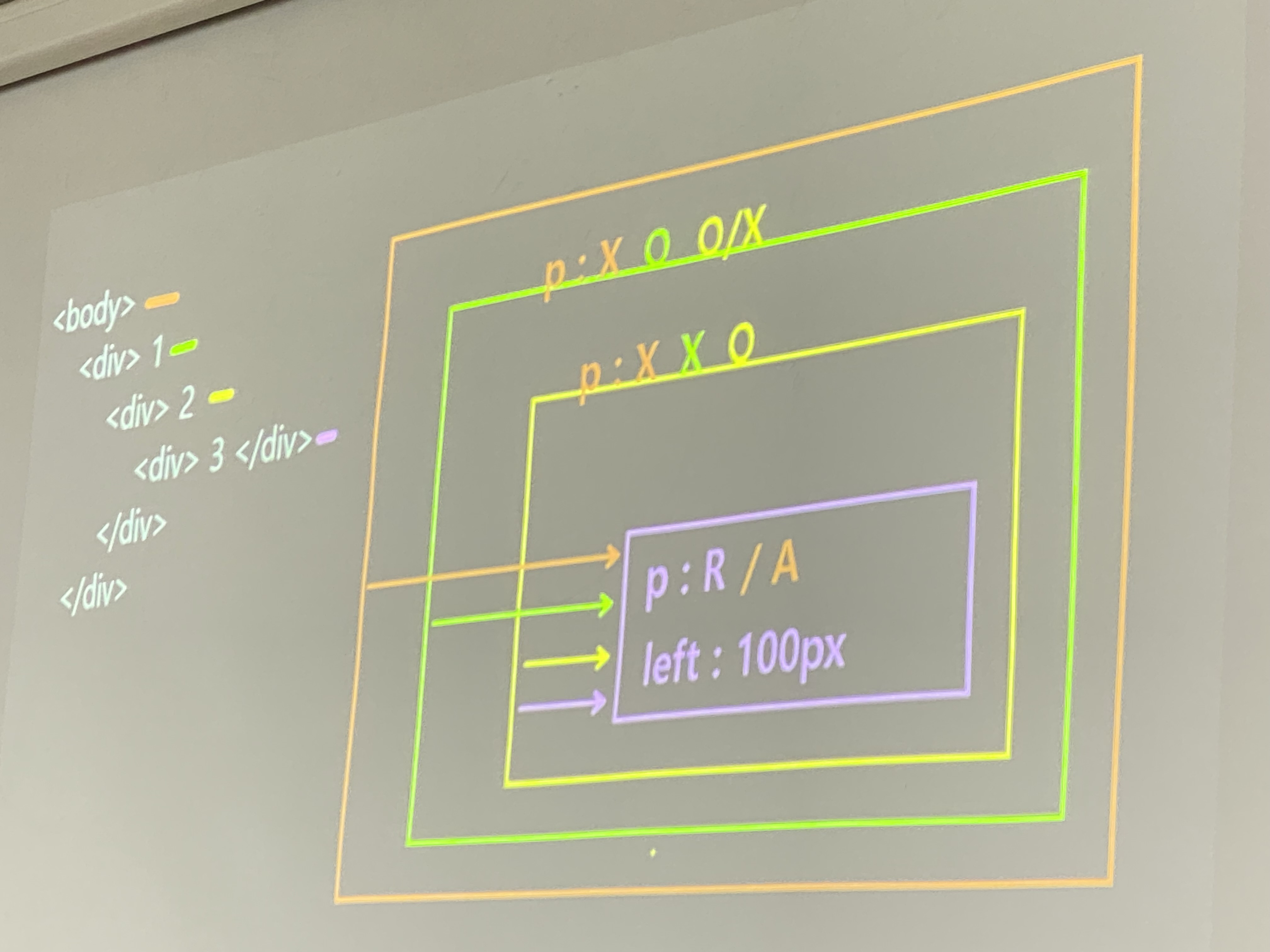
<div> 태그 등의 영역 크기를 100px으로 설정했을 때

  • 100px 이상으로 <div>가 더 튀어나와서 크기를 100px으로 딱 맞추고 싶을때 - box-sizing : border-box;
  • 100px 미만으로 <div>가 더 적게 나와서 컨텐츠 영역만 100px으로 맞추고 싶을때 - box-sizing : content-box;


CSS Box Model

CSS의 각 태그의 영역은 Box Model로 구성

  • content : 글씨가 삽입되는 영역
  • border : 테두리 영역
  • padding : content와 border 사이
  • margin : border와 다른 태그 영역 사이

* Box Width : 800px
- width:800px + padding:100px + border:100px
  = 800px+(100+100)px+(100+100)px = 1200px
----------------------------------------------------------------------
* Box Width : 100%
- width:100% + padding:100px + border:100px = 100%+400px
----------------------------------------------------------------------
* Box Width : auto
- width + padding + border = 100%
----------------------------------------------------------------------
* box-sizing : border-box
- width + padding + border = width
- width:80%; padding:100px; border:100px = 80%+400px
- width:80%; padding:100px; border:100px; box-sizing:border-box = 80%


* box width
- width:600px; padding:100px  -- real box width : 800
- width:400px; padding:100px; border:100px  -- real box width : 800
- width:800px; padding:100px; border:100px  -- real box width : 1200
- width:800px; padding:100px; border:100px; box-sizing:border-box  -- real box width : 800


padding & margin : 요소를 중심으로 영역을 확장시키는 것

(값을 몇개 주느냐에따라 설정값이 다른데 4개를 주었을 때 시계방향으로 위 오른쪽 아래 왼쪽 순서임)


padding (안쪽 여백, 크기 변경)

자신의 몸을 확장 {테두리를 기준으로 요소의 안쪽 여백 지정}

 - 사용법 -

  ○ padding : 10px;                            모든 방향에 적용

  ○ padding : 10px  10px;                  top, bottom / right, left 적용

  ○ padding : 10px  10px 10px;            top / right, left / bottom 적용

  ○ padding : 10px  10px 10px 10px;          top / right / bottom / left 적용


margin (바깥쪽 여백, 위치 변경)

 자신을 중심으로 떨어지게끔 만드는 것 {테두리를 기준으로 요소의 바깥 여백 지정}

 - 사용법 -

  ○ margin : 10px;                           모든 방향에 적용

  ○ margin : 10px  10px;                top, bottom / right, left 적용

  ○ margin : 10px  10px 10px;         top / right, left / bottom 적용

  ○ margin : 10px  10px 10px 10px;       top / right / bottom / left(시계방향) 적용

  ○ margin : auto;                            웹페이지 가운데 위치

  ○ margin-top                          위쪽 바깥 여백

  ○ margin-right                        오른쪽 바깥 여백

  ○ margin-bottom                    아래쪽 바깥 여백

  ○ margin-left                          왼쪽 바깥 여백


**position

1. 움직이는 방법
2. 위치 속성과 함께 사용


*위치 속성

 
1. top / right / bottom / left
2. position 속성이 없는 경우 이동 불가
3. position 속성 사용시 층이 발생되는데(겹칠 수 있음) 이걸 방지하기 위해서는 z-index 사용해야함

4. position 있고 없는 것중에 position이 있는 태그가 위 / 나중에 작성한 코드 순서가 제일 위

  /형제 요소간 z-index를 모두 사용시 높은 숫자가 위


**position 속성값

1. static(움직이지마) : 기본값, 이동 불가 / margin:auto라는걸 사용했을 때 적용 가능(여백 속성이라 가능)

    정적 위치 지정방식(static)

<!DOCTYPE html>
<html lang="ko">
<head>
    <meta charset="UTF-8">
    <meta name="viewport" content="width=device-width, initial-scale=1.0">
    <title>static</title>
    <style type="text/css">
        #header{width:800px; height:150px; background: #ff9900}
        #content{width:800px; height:150px; background: #99cc00; position: static; left:100px}
        #footer{width:800px; height:150px; background: #0099ff; position:static; margin:auto}
    </style>
</head>
<body>
    <div id="header"></div>
    <div id="content"></div>
    <div id="footer"></div>
</body>
</html>

margin:auto 사용했을때


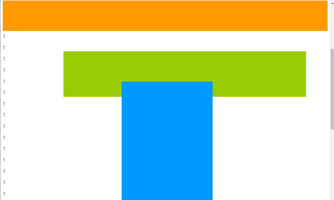
2. absolute : 절대 위치 지정, 형제 요소간 동일한 중심점 사용(형제나 부모가 인식x/margin:auto 사용x)

  정적 위치와 유사하나 원래 위치의 상대적인 만큼 이동한다. 절대적 위치 지정방식(absolute)

ㄴ>사용시 이렇게 나타남

하지만 이렇게 위치 지정해주고 보면 이렇게 나타남

<!DOCTYPE html>
<html lang="ko">
<head>
    <meta charset="UTF-8">
    <meta name="viewport" content="width=device-width, initial-scale=1.0">
    <title>absolute</title>
    <style type="text/css">
        #header{width:800px; height:150px; background: #ff9900; position:absolute; left:50px; top:50px}
        #content{width:800px; height:150px; background: #99cc00; position:absolute;left:100px; top:100px}
        #footer{width:800px; height:150px; background: #0099ff; position:absolute;left:150px; top:150px}
    </style>
</head>
<body>
    <div id="header"></div>
    <div id="content"></div>
    <div id="footer"></div>
</body>
</html>


        #header{width:800px; height:150px; background: #ff9900; position:absolute; left:50px; top:50px; z-index:1}
 

#header { width : 800px ;  height : 150px ;  background :  #ff9900 ;  position : absolute ;  left : 50px ;  top : 50px ;  z-index : 1 }


<!DOCTYPE html>
<html lang="ko">
<head>
    <meta charset="UTF-8">
    <meta name="viewport" content="width=device-width, initial-scale=1.0">
    <title>absolute</title>
    <style type="text/css">
        #header{width:800px; height:150px; background: #ff9900; position:absolute; left:50px; top:50px; z-index:1}
        #content{width:800px; height:150px; background: #99cc00; position:absolute; left:100px; top:100px}
        #footer{width:800px; height:150px; background: #0099ff; position:absolute;left:150px; top:150px}
    </style>
</head>
<body>
    <div id="footer"></div>
    <div id="header"></div>
    <div id="content"></div>
</body>
</html>


3. relative : 모든 요소가 독립된 중심점 사용(형제나 부모가 인식함/margin:auto사용가능)

    기본적인 위치 지정 방식, 문서의 기본적인 흐름을 따른다. 상대 위치 지정방식(relative)

<!DOCTYPE html>
<html lang="ko">
<head>
    <meta charset="UTF-8">
    <meta name="viewport" content="width=device-width, initial-scale=1.0">
    <title>relative</title>
    <style type="text/css">
        #header{width:800px; height:150px; background: #ff9900; position:relative; left:50px; top:50px}
        #content{width:800px; height:150px; background: #99cc00; position:relative; left:100px; top:100px}
        #footer{width:800px; height:150px; background: #0099ff; position:relative; left:150px; top:150px}
    </style>
</head>
<body>
    <div id="header"></div>
    <div id="content"></div>
    <div id="footer"></div>
</body>
</html>

-> 움직이는 방법이 달라서 결과가 다름(absolute / relative)


4. fixed : 스크린을 기준으로 지정된 위치에 고정

기본 흐름을 따르지 않고 부모 엘리먼트의 상대적으로 지정된다. 고정적 위치 지정방식(fixed)

엘리먼트의 위치가 브라우저 창에 상대적으로 지정된다.


<!DOCTYPE html>
<html lang="ko">
<head>
    <meta charset="UTF-8">
    <meta name="viewport" content="width=device-width, initial-scale=1.0">
    <title>fixed</title>
    <style type="text/css">
        #header{width:100%; height:100px; background: #ff9900}
        #content{width:800px; height:150px; background: #99cc00}
        #footer{width:300px; height:400px; background: #0099ff}
    </style>
</head>
<body>
    <div id="header"></div>
    <div id="content"></div>
    <div id="footer"></div>
</body>
</html>

메뉴탭의 상단고정시 사용함


*STICKY : 사용자 스크롤의 기준에 배치됨

<!DOCTYPE html>
<html lang="ko">
<head>
    <meta charset="UTF-8">
    <meta name="viewport" content="width=device-width, initial-scale=1.0">
    <title>fixed</title>
    <style type="text/css">
        #header{width:100%; height:100px; background: #ff9900;position:sticky;left:0;top:0;z-index:10;margin-top:200px}
        #content{width:800px; height:150px; background: #99cc00;position:relative;left:200px;top:300px}
        #footer{width:300px; height:400px; background: #0099ff;position:absolute;left:400px;top:700px}
    </style>
</head>
<body>
    <div id="header"></div>
    <div id="content"></div>
    <div id="footer"></div>

첫 화면

스크롤바를 내릴경우

스크롤바 내릴경우


728x90
반응형